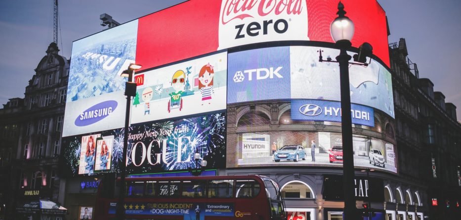
The logo quiz had become an entertaining mobile game popular in all scope of ages. This game is where a vector or a picture without its brand name is shown, and the player should guess its name to proceed to the next round. It is answered through categories like naming automobile labels, fast food chains, and even wardrobe apparels. In every round, it gets harder and harder ranging from the most popular brands around the globe to local shops.
People quite enjoy this type of mobile game as it ranked as one of the few apps with the most installation in the world. But what makes it very interesting and fun is the concept of familiarity. The familiarization of color, shape, and texture quickly gives way in the identification of the marque. Humans are highly intelligent beings that can recognize something out of the smallest details, and that is why everyone is hooked in playing this mobile game.
But enough about this game and let’s dig deeper to what makes the whole idea engrossing— logo. Trademarks have helped us in a way that we easily recognize something without reading it. It has become a basis for us to choose between things quickly. For example, when using a vending machine which do you prefer the insignia of a white banner with a red background or the one with a white banner and a red and blue background (Coca Cola vs. Pepsi)?
Now that we’ve established the importance of logos, this article will give you tips and inspiration in helping you create the perfect logo or trademark for your business.
1. Logotypes
Logotypes or most commonly known as wordmarks are font-based logos that highlight the company name or the brand name. This is best used when you have a unique or catchy business’ name. And of course, to give it a better visual, you should always remember to choose a font that is highly appropriate with your business interest.
The most famous logos with this style are Coca-Cola, Google, and Amazon. A person can quickly identify the trademark because of its color and font, and the unique brand name completes the whole ensemble. If you’re interested in a business that offers expertise or professional human resources, then find a font that looks firm and formal to the eye. If you’re into fashion, then find a font that looks elegant and soft.
2. Lettermarks
Lettermarks or monograms are best used for a company name with a very long title. Like Logotypes it focuses on font and color, but the difference is that the company name is abbreviated or the initials are used to shorten it.
Try, recalling NASA, FedEx, HBO and CNN, this acronyms are easier to memorize than Federal Express or Cable News Network. It is easily understood in 3D Custom Metal Business Signs outside huge buildings. But take note, that if your company is not that popular yet, then try adding the full name under the logo, so people can easily read what it means.
3. Logo Symbols
Logo Symbols or commonly known as pictorial mark or brand mark are what we usually understand as icons. This type is a graphic-based logo that is generally an image equivalent of the company name. But some try to be more creative by appropriating images that are connected to their business interest.
Remember, Target, Apple, Instagram, Twitter, and Pinterest? All of their chosen icons are directly related to their brand name which makes it witty and at the same time unique. In using this type of logo, bear in mind that simpler graphics are more appreciated to captivate the wholeness of your brand name.
4. Mascots
This type of logo usually depicts the unique character of the brand. It is character-based that tries to illustrate a fun and appealing character involving vibrant colors, cartoonish and, childish characters that is appropriate or connected to the business name.
This is quite common in basketball teams like Chicago Bulls and other collegiate basketball teams. Others like KFC’s colonel and Frosted Flakes’ adorable tiger are also familiar among children. The objective of this type is that it depicts a fun and inviting atmosphere to its customers.
5. Abstract Logo
When you see a symmetrical logo that depicts smooth line, curves and shape then that is an abstract logo. Commonly, it uses combinations of geometric shape to form an image. Since it is abstract, it gives you more freedom in creating your brand when compared to other types of logos. You can be creative in choosing the shape and color of your logo.
Remember Chanel, Adidas, LG, Panam, Chase, and Unilever? All of them involved art and combination of many shape forms and colors. This made it memorable to people and easily recognizable. However, when your company isn’t that popular yet, it is advised that you incorporate the brand name in the logo so that people can now get acquainted with it quickly.


