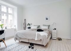
It often seems that we’re never happy with what we have. With high ceilings, we complain about lost energy and ‘cold’ environments. When we have low ceilings, we try to make them look higher. The truth is that both have their pros and cons. But let’s be honest! No matter how trendy high ceiling rooms are, they don’t help with light and sound control and suck all is left in our family budget – like cold lemonade in the summer.
Now, the trick to reduce expenses but still give the impression that the room is large is done by proper molding installation. We can use trims to enlarge a rather small room or bring up a low ceiling. It all depends on the room’s structure but on furnishing as well. For example, an average sized room with a low ceiling but big openings will look bigger. But it’s not always possible to bring down the walls and enlarge windows. And that’s where the trims jump in to save the situation.
Which trims can you use? Actually, anything you like.
- Wainscoting installation
- Ceiling molding
- Baseboards
- Chair rails
- Arched openings
- Window casing – you name it!
The importance of wainscot wall panels
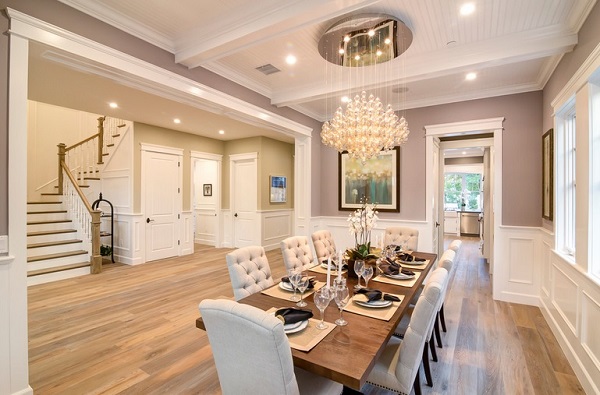
Scale & proportion are the two magic words when it comes to the installation of a modern wainscoting panel. These are actually two of the most fundamental principles in the world of interior design. In order to bring balance and create the right visual impact, the wainscot panel must cover the right portion of the room. And the moldings placing the board should be of the right proportion to another too.
You play with proportion to give the impression you want. One way to make rooms look larger is to give the impression that the ceiling is high. So, if the room is rather small and has a low ceiling too, you really need to stick to the principle of scale and proportion to make it look larger.
How high should wall panel wainscotings go?
To give the impression of a higher ceiling, the wall panel wainscoting must come down. The lower it stands, the better. You can still cover the entire wall with the panel and some would also suggest covering the lower 2/3 of the wall. But in such cases, you should pay attention to the panels and colors you choose.
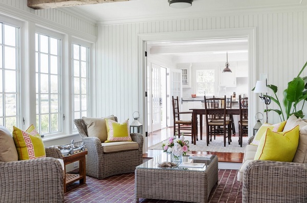
Choose beadboard wainscoting since it has vertical planks and thus it will visually make the wall look taller. The colors you select are also very important. Avoid big contrasts between the ceiling and wall. It’s best to stick to the same color. If the walls are painted in dark colors, choose a tad lighter shade for the ceiling. If you paint them in contrasting colors, you will create a visual line at the point where they meet and will bring the ceiling even further down.
What’s the role of moldings?
The crown molding must not be very thick. And it must be painted the same color as the wall for the avoidance of creating a vertical line. But if there are windows, make sure the header of the casing is rather large. This will give the windows a few extra inches of height making the room look taller and thus bigger. You can follow the same advice for the door casing. When thicker, it brings the opening up and so raises the whole room.
Don’t forget that the baseboard of your flat panel must match the trims at the upper part of the wall to bring balance. It shouldn’t be too big to bring the eye down, but it must not be out of proportion in relation to the crown moulding either.
How about the chair rail?
Even if you don’t install a bead board and like to place a molding on its own, don’t split the wall into two. This trim would influence the proportions in the room and if it’s rather high or mid-way up the wall, it will make the room look short. So, keep the chair rail low just like with wainscotings.
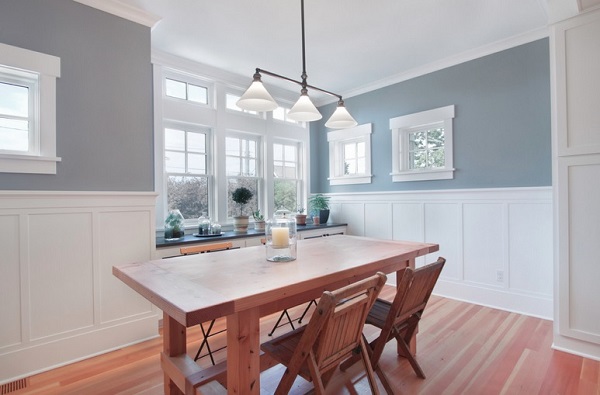
Play with trims to bring excellent balance in the room
Remember that moldings allow you to bring balance and play with proportions to create a natural and smooth flow from floor to ceiling and from one room to the next. So, the whole idea is to keep them low and thus in contrast to the rest of the wall décor elements.
For instance, all wall decorations – from artwork and framed pictures to curtains – must be placed as high as possible to let the eye travel up and thus stretch the ceiling higher and give the impression that the room is larger.
One last tip: avoid pendants. Invest in recessed lighting. Fixtures hanging from the ceiling will squash the room. And that’s NOT your intention.


